Component configuration
Overview
Bobcat allows to configure AEM components in author mode using configuration files To configure the component we need to know two things.
- Where the component is in content tree
- What is the component configuration
Picking component for test
controller.execute(AemActions.CONFIGURE_COMPONENT,
        new ConfigureComponentData("container", "Text", 0,
            new ResourceFileLocation("text.yaml")));
To configure component we use action with specific parameters:
- place in content tree
- component name
- which component if there is many of them
- configuration file
Last one is described in another section. Lets focus on first three.
AEM Content Tree
Component create tree structure where containers can be described as branches and components as leaves.
Place in content tree
The first parameter can be also described as selecting a branch. Each container is another level of branches.
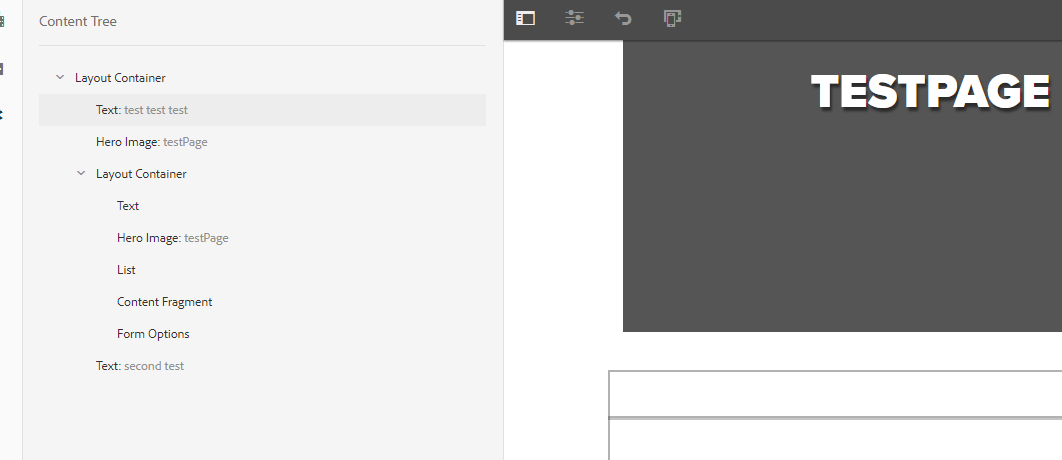
For example to select Text component with test “test test test” our parameter would be simple” container but for Form Options would be container/container
What happens if there are many containers on the same level:
- container
  - container
  - container
    - Text
In that case we need to tell Bobcat which container should be used (we treat first container as ‘0’).
To find Text component: container/container[1]
Component name
This one is simple we look into content tree as choose component name
Component order
We can have many components with the same name on the same branch. In our image we have two Text components so the first one will be ‘0’, second ‘1’
Configuration file
As mentioned above the last parameter is an yaml file with component configuration. ResourceFileLocation is provider that tells Bobcat to search it in test/resources folder. If someone would like to keep them for example in cloud then new class that implements ConfigurationLocation interface should be written and replace current provider.
Each yaml file can be used for one component configuration. It should contain all information we need for component dialog. Its structure is following:
Tab name:
- type: dialog field type
  value: dialog field value (handling specific for each field)
- type: dialog field type
  value: dialog field value
Second tab name:
- type: dialog field type
  value: dialog field value
Example for We.Retail’s Hero Image component:
Asset:
- type: IMAGE
  value: northern-lights.jpg
Properties:
- label: Heading
  type: TEXTFIELD
  value: Heading
- label: Title
  type: TEXTFIELD
  value: Title
- label: Button label
  type: TEXTFIELD
  value: Button
- label: Link to
  type: PATHBROWSER
  value: /content/we-retail/us
- label: Full width
  type: CHECKBOX
  value: true
“Asset” and “Properties” are tab names. If component dialog has only one tab this name can be ommited. Then we have sets label type and value that fill dialog fields.
- label - select dialog field with this label. If there is no label the fields will be selected in order.
- type - type of dialog field. All available OOB fields are displayed in section below
- value - what value should be set
- clear - true/false, currently viable only for Multifields, you decide if the field’s state should be set to a blank before entering the new value. This translates to deleting all existing items in a Multifield before adding any new ones.
Components without tabs in the dialog
Some components, like e.g. We.Retail’s Link Button, do not have tabs in the dialog:
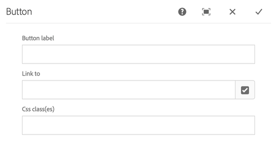
To support such case and be consistent with the usual way of component configuration, we have introduced a special handling for a no_label tab name. This will skip looking up a tab with such name and switching to it.
An example configuration, for above dialog:
no_label:
  - label: Button label
    type: TEXTFIELD
    value: Click me!
  - label: Link to
    type: PATHBROWSER
    value: /example/page
  - label: Css class(es)
    type: TEXTFIELD
    value: an-example-class
Multifields
This example shows how we can fill multifield dialog fields:
Properties:
- label: Option Entries
  type: MULTIFIELD
  clear: false
  value:
  - item:
    - label: Active
      type: CHECKBOX
      value: true
    - label: Text
      type: TEXTFIELD
      value: Text
    - label: Value
      type: TEXTFIELD
      value: Value
  - item:
    - label: Text
      type: TEXTFIELD
      value: Text2
    - label: Value
      type: TEXTFIELD
      value: Value2
Dialog fields types
AEM 6.4.X
| Field Type | Values |
|---|---|
| CHECKBOX | true |
| TEXTFIELD | text |
| IMAGE | image name from DAM |
| PATHBROWSER | path |
| SELECT | text from dropdown |
| RICHTEXT | text |
| MULTIFIELD | list of “item” each with own fields (see example above) |
| RICHTEXT_FONT_FORMAT | BOLD/ITALIC/UNDERLINE |
| RICHTEXT_JUSTIFY | JUSTIFY_LEFT/JUSTIFY_CENTER/JUSTIFY_RIGHT |
| RICHTEXT_LIST | NUMBERED/BULLET/INDENT/OUTDENT |
| RADIO_GROUP | text from radio option |
AEM 6.5
Version: >= 2.1.0
| Field Type | Values |
|---|---|
| CHECKBOX | true |
| TEXTFIELD | text |
| IMAGE | image name from DAM |
| PATHBROWSER | path |
| SELECT | text from dropdown |
| RADIO_GROUP | text from radio option |
| TAGBROWSER | text for each tag to select, each tag is a separate list member of “value” |
| MULTIFIELD | list of “item” each with own fields (see example above) |
| RICHTEXT | text |
| RTE_OPTIONS | simple fields on RTE toolbar, without any sub-options; e.g.: Bold/Underline/Italic/Unlink (just provide the title of the button) |
| RTE_OPTIONS_LISTS | Lists options: Bullet List, Numbered List, Indent, Outdent |
| RTE_OPTIONS_PARAGRAPH_FORMATS | Paragraph Formats option: Paragraph, Heading 1-6, Quote, Preformatted |
| RTE_OPTIONS_HYPERLINK | see below |
RTE_OPTIONS_HYPERLINK has a bit more complex configuration, i.e.:
  - type: RTE_OPTIONS_HYPERLINK
    value: |-
      Path: #
      Alt Text: alternative text
      Target: New Tab
Please note the multiline handler, |-. It keeps the newlines and does not append additional one at the end. For more info, see link.